
Berolina Bakery
Website redesign for a local bakery
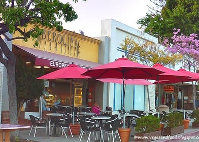
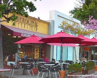
Berolina Bakery is a local bakery in Glendale, California. It is known for its fresh artisan breads and delicious European cakes, with a variety of pastries available. The bakery offers pickup orders, delivery in some areas of the city, and it ships across the U.S. You can enjoy breakfast or lunch in the cozy dining area, along with limited food and beverage options.
I recently redesigned the website for Berolina Bakery to enhance its user experience by improving the website's information architecture and visual appeal.
A particular emphasis was placed on simplifying the selection and customization process in the cakes section.
About Berolina Bakery
Project Overview
Problem Statement
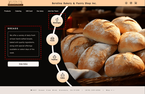
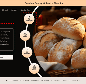
Streamlined Navigation and Structure: Redesigned the website’s information architecture and navigation for easier products discovery.
Enhanced Visual Appeal: Updated the design to create a more attractive and functional layout with a seamless browsing experience.
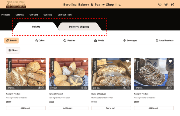
Clear Product Highlights: Provide details like availability, ingredients, customization options, and ordering methods clearly on each product.
Improved Cake Personalization: Simplified the customization process to make it easier and more accessible.
Integrated Ordering Tips: Display warnings, tips, and key FAQs directly during product selection and checkout.
The Berolina Bakery website, despite offering a wide variety of products across different categories, struggles with a cluttered design, ineffective information architecture, poor navigation, and incomplete or occasionally confusing product details. These issues contribute to user frustration during the ordering process.

Design Approach
Design Target Users
First-time Visitors: New users unfamiliar with the bakery, benefiting from a simplified layout to find products and navigate efficiently.
Local Online Shoppers: Residents of Glendale(California) and surrounding areas who visit the website to check product availability and place online orders, benefiting from the streamlined navigation and clear product details.
Health-Conscious Shoppers: Customers with dietary restrictions or those seeking clear ingredient information and customizable options based on their preferences.
Time-Constrained Clients: Parents, corporate clients, or event planners who need a quick and easy way to find products (breads, cakes, pastries, catering, foods & drinks, etc.), view details, and place orders for celebrations.
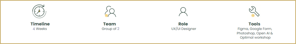
As part of a UX-Land bootcamp project, I volunteered to redesign the website, focusing on improving the information architecture and enhancing the cake personalization experience to better serve users and showcase the bakery's unique offerings. Details are provided below:
Designe Thinking
I followed a Double Diamond approach based on the Design Thinking methodology. It was not a linear path; I bounced between stages as the project progressed.
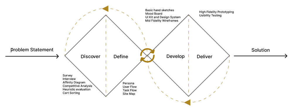
Discover
To understand the users' pain points and develop effective solutions, I employed a comprehensive research approach that consisted of the following methods:
Heuristic Evaluation
Competitive Analysis
Interview
Cart Sorting
Interview
In the first step, within the limited time available, I conducted interviews with a number of users. During these interviews, they identified the weaknesses of the existing website:
Outdated and Unattractive Homepage Design: The current home page design is perceived as unattractive and needs a modern update.
Illegible and Dated Fonts: The fonts used are difficult to read and appear outdated, impacting user experience.
Irrelevant Pop-up: There is an old pop-up from the Covid era that no longer serves a purpose and should be removed.
Excessive and Informationally Lacking Photos: The website features numerous photos with no accompanying information or purchasing options.
Confusing Online Store Section: The online store section is difficult to navigate and needs to be streamlined for better usability.
Unappealing Color Scheme: The color palette is unappealing and inconsistent, affecting the overall aesthetic of the site.
Overly Long Texts: There are lengthy texts that deter users who prefer concise and direct information.
Disorganized Categories: The categories are poorly organized, making it hard for users to find what they are looking for.
And expressed their requirements for its redesign:
Intuitive Navigation: Improve website navigation for easier access to sections.
Detailed Product Info: Include price, size, and servings in product categories.
Varied Payment Options: Offer secure payment methods like PayPal and other choices.
Ingredient Listings: List ingredients clearly for better transparency.
Guest Checkout: Allow first-time orders without account creation.
Social Media Links: Add links to social media for customer reviews.
Business Story: Share the history or story of the business.
Product Freshness: Show availability and freshness dates for products.
Cake Categories: Organize cakes into clear, distinct categories.
Order Process: Display cake ordering steps on Cakes pages.
Visible Ordering Info: Make ordering instructions easy to find and understand.
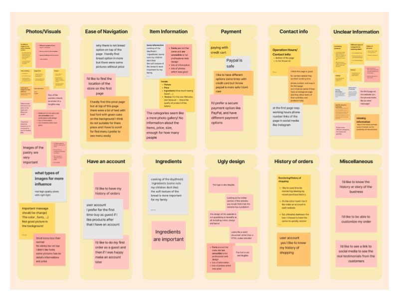
Affinity Diagram
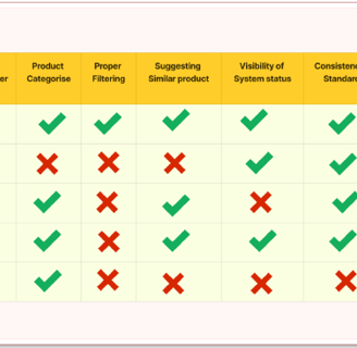
Competitive Analysis
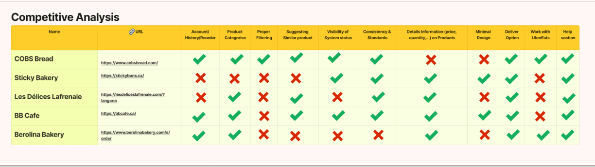
Additionally, I expanded our scope to include platforms like ruwiscakes.com , acasadolce.ca and celebritycakestudio.com , to recognizing that their designs could also inform the development of our website for the cake customization section. By examining these diverse platforms, I ensured that our design encompasses all the necessary elements to deliver a seamless and engaging user experience.
With the creation of the affinity diagram, I identified the most important factors to consider:
Ease of navigation and finding items through categorization
Ease of ordering products
Simple cake customization procedure
Detailed product information, including ingredients
More attractive design
Ability to view order history with an account
Secure payment options
The process started with a competitive analysis of other websites that are in direct competition with the target website. During the evaluation, I made specific observations about various aspects of the competing websites to gain a clearer understanding of the essential features of our design. I conducted a thorough analysis of these platforms to grasp their overall structure and functionalities, providing valuable insights for our own design process.
Cart Sorting
Some of the observations from Competitive analysis had a direct impact on the contents of the cards that I was creating. Based on the insights gained from the competitive evaluation, I made necessary modifications to the card contents to enhance their effectiveness and relevance.
Then I worked on Cards and their contents again, based on a re-evaluation of the competitive analysis.
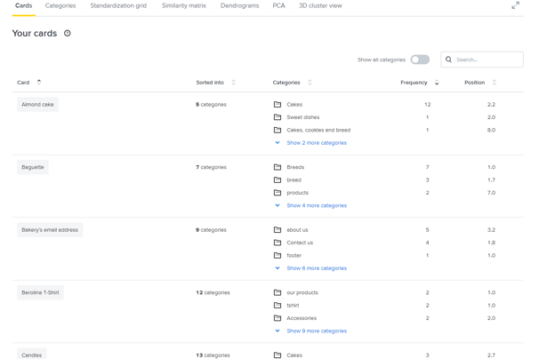
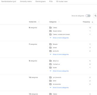
I decided to conduct our card sorting using the Optimal Workshop platform. This choice significantly simplified our work, as it enabled us to view the results categorized based on different criteria. For instance, I could easily identify the Categories assigned to each Card and observe the Cards designated for each Category.
Outdated and Unattractive Homepage Design:
Cluttered Global Menu: Disorganized, lacking clear categories for bakery services and products, which reflects poor information architecture.
Outdated Hero Image: Fails to showcase the full range of the bakery's products.
Long Pop-up: A lengthy block of tips and warnings, felt tedious and unlikely to engage users.
Instagram Testimonial Representation: Not effectively showcased and fail to highlight the bakery's true capabilities.
Footer Information: The bakery's hours and location can be added to the footer, eliminating the need for a dedicated section on the front page.
Heuristic Evaluation
Order Online Page
Define
The insights I gained from surveys and interviews leading up to the persona. The main goal is to display those patterns and pain points, which allowed me to further empathize with users.
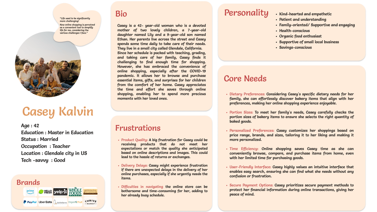
Persona
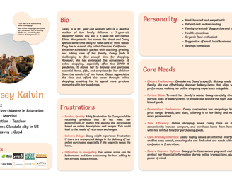
Site Map
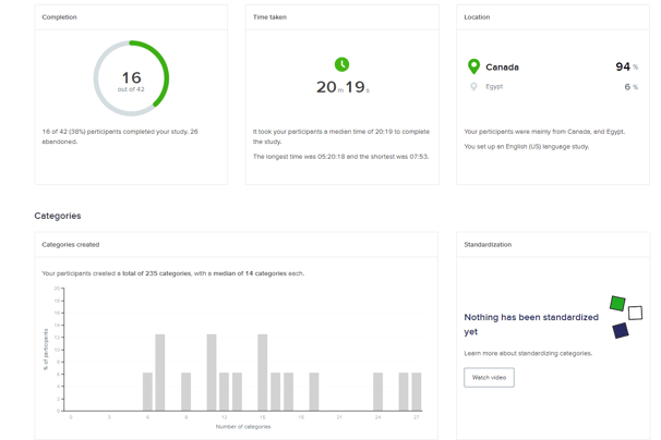
To ensure our information architecture meets user expectations, I conducted 16 open card sorting using the Optimal Workshop platform. After the initial exercise, I developed our first version and iteratively refined it based on user testing and competitive analysis.
Here is our final site map and in this case study, I have concentration on the 'Cakes' Section:

Based on the information I gathered, observations, and test results, I revised our site map and user flow multiple times. The final version of the project was shaped by several times of usability testing and having more additional feedback on our work.
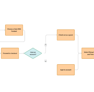
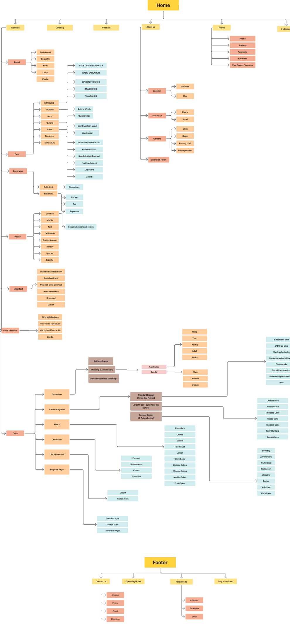
Final User Flow
Develop
Challenges
Ease of navigation and finding items
Solutions
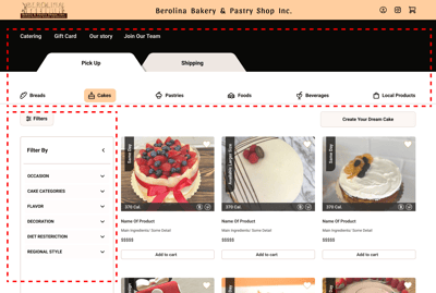
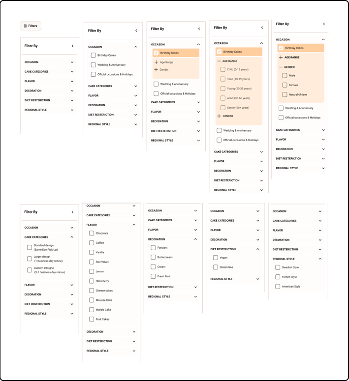
Implement a clear, categorized menu and filtering section to quickly locate items.
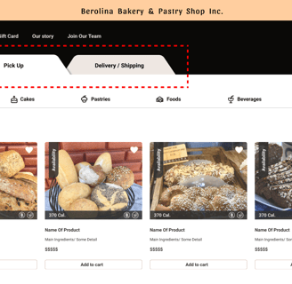
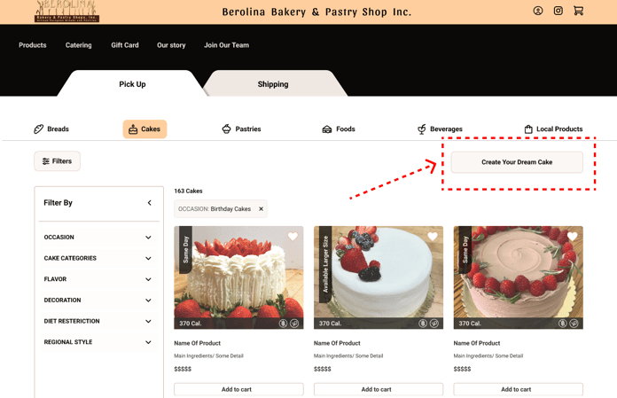
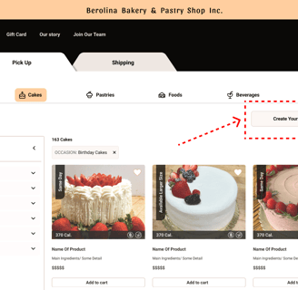
I also added two different sections for 'Pickup' and 'Shipping,' which were not clear enough for customers on the original website.
I don't need a search bar because I considered it a futile task to remember the name and type of bakery products.
Simple cake customization procedure
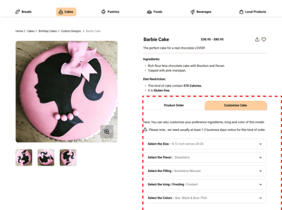
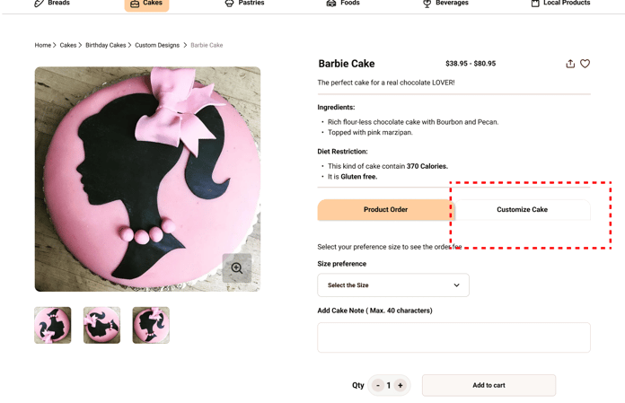
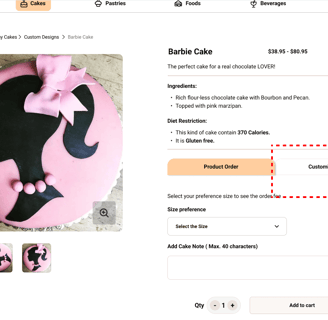
I also added a 'Customize Cake' section on the product page for easy access to the customization process at any time if needed.
Detailed product information, including ingredients
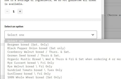
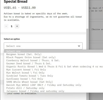
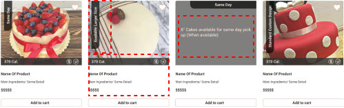
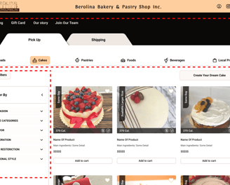
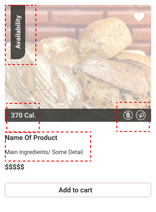
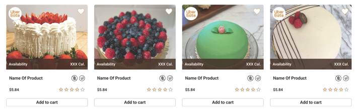
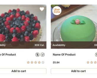
I include important details on each product card, such as dietary restrictions, calories, key ingredients, and the product price.
Product availability is crucial, so I include this information on each card before users visit the product page.
By hovering over the carts, you can see more details about availability and order structure that users need to consider before placing an order.
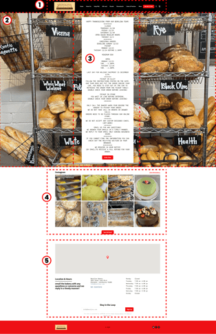
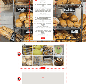
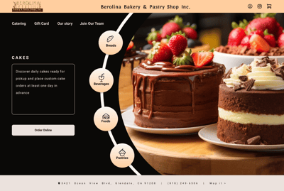
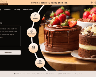
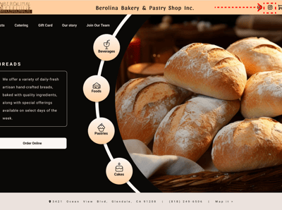
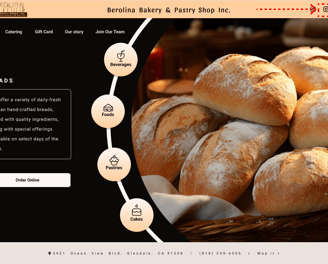
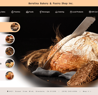
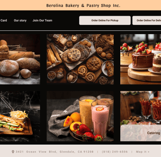
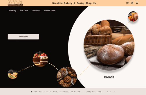
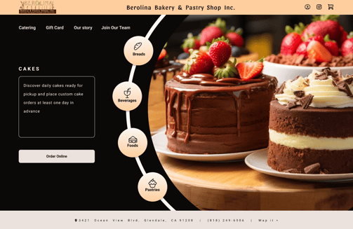
Redesigning the Hero Area for Berolina Bakery : The original Berolina Bakery website featured a complex, confusing design with an uninspiring landing page, making it difficult for users to quickly find and engage with the bakery’s offerings. To address these issues, I redesigned the hero area to enhance user experience and drive engagement.
Clarity and Focus: The old hero area was unclear. I redesigned it to highlight key products and promotions, providing a clear entry point.
Visual Appeal: The previous design was dull. I introduced vibrant visuals and a dynamic layout to better reflect the bakery's brand.
Improved Navigation: Simplifying the hero area now lets users easily find featured products and specials, enhancing their browsing experience.

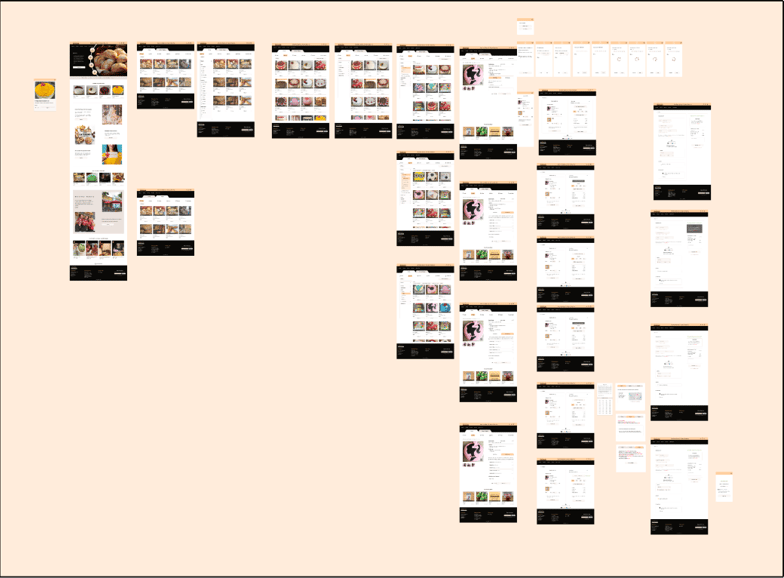
Sketches and Wireframes
I initially mapped out our ideation using hand-sketched low-fidelity wireframes, aiding communication within the team during the early design stages. Later, I transitioned to creating low-fidelity wireframes on Figma to visualize page layouts and design direction. These wireframes underwent several iterations before final content development.

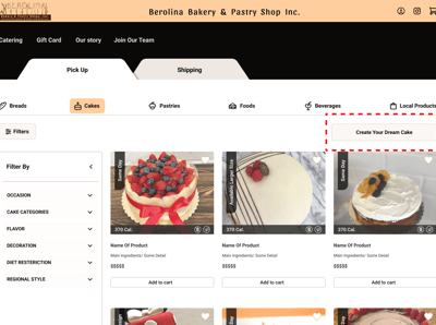
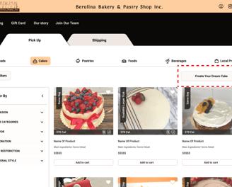
I can Introduce an interactive customization section with real-time previews and easy-to-use options for personalization, accessible via a prominent 'Create Your Dream Cake' button at the top of the 'Cakes' page.
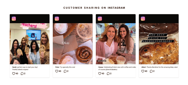
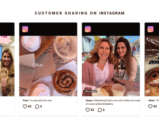
"This bakery is performing well on Instagram, so as a testimonial, I decided to feature their stories and key Instagram content prominently at the bottom of the homepage and added an icon for it at the top of the page."
Highlighting the bakery's Instagram activities in the new design
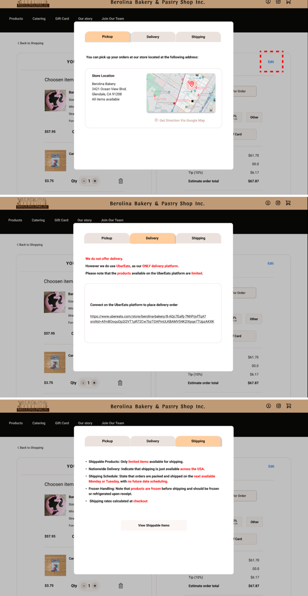
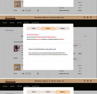
The cost of purchasing products will vary depending on the type of order. After a detailed review of the Berolina Bakery website and FAQ section, I found that products are offered in three ways: Pickup, delivery, and shipping.
Customers can choose the pickup option to access the store at and collect their online orders.
Additionally, through the ONLY UberEats platform, customers can order a limited selection of products and have them delivered to the specified address.
The bakery's products are also available for shipping across the USA, with shipping costs calculated at checkout based on the entered address.
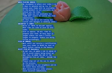
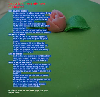
Firstly, I am considering having two separate tabs at the top of the product pages to display the two different ordering methods. I plan to combine shipping and delivery into one tab, but will include a warning message informing users that delivery is not available through this platform. I can also include a link to the UberEats platform for ordering. (I plan to update the Delivery / Shipping section in the future.)
Secondly, I will add a section (Edit) on the Cart page to display and update information based on the selected ordering method.
When a user clicks on 'View Shippable Items', they will be directed to the product page with the 'Delivery/Shipping tab'.
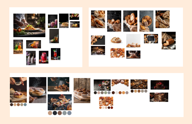
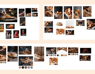
Moodboard
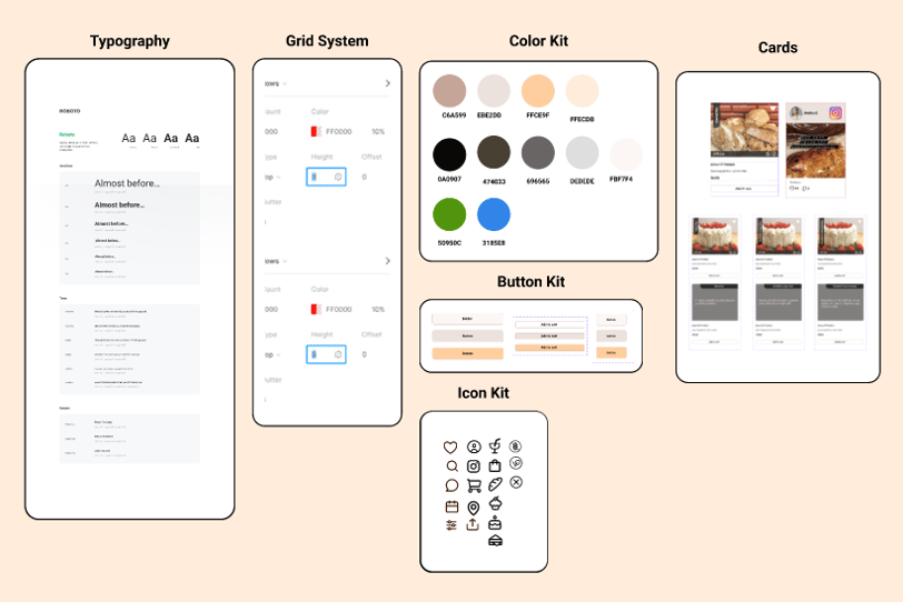
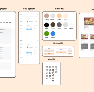
UI Kit
I developed a complete UI kit to serve as a reference for templates and components. This kit ensures that interface development is smooth, consistent, and efficient throughout the project.
Deliver
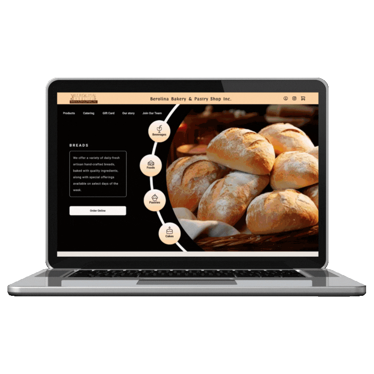
High Fidelity Wireframe
Prototype
Here is the last prototype, displaying what I've achieved through our design process.
Usability Tests and Iterations
Throughout the project, I went through multiple iterations, driven by the insights I gained from usability tests. These tests were instrumental in shaping our decisions and constantly enhancing our project.
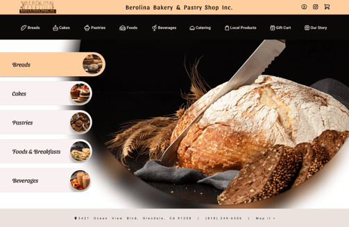
To create a 'Hero Area'—including the hero image, menus, and more—that immediately captures the user's attention and highlights the bakery's products and services, I designed several models and ultimately settled on the current design.
A/B Testing

"Why not? The hero image area includes multiple pictures, which may make the design appear outdated. Additionally, the button at the top is quite large and doesn't contribute to a cohesive design."
"Why not ? I used a rotating banner for bakery product images, but it seemed outdated, so I needed a new approach. Additionally, the top menu was too cluttered and confusing."
Why not? " It was a rotating banner. The idea had potential but needed more creativity. However, unlike the previous models, it seemed quite isolated, which led us to finalize the current design."
Why not? "The reason I chose this final design was because it allows product information to be displayed clearly in front of the product showcase. It also offers the flexibility to update and customize this information at any time"

"The first change I made to the cards was removing the scoring section, as it was not relevant to the bakery's products. Instead, I retained only the testimonial section, which was more meaningful.
Secondly, I revised the cake section to reflect the bakery's three main categories: daily cakes, larger sizes, and custom cakes. I organized these sections and provided explanations for each cake model, so users can easily understand the delivery times before selection.
Additionally, I removed the 'UberEats' section from the cake introductions because I concluded that...?????????????????????"
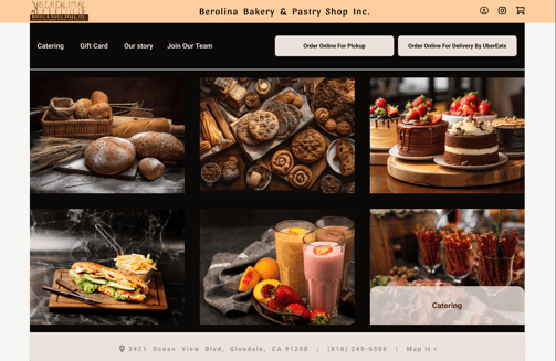
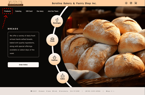
"Based on user feedback from our tests, I found that click on the items in the Hero Image was insufficient to guide users to the product page. Therefore, in the final version, I added a 'Products' option to the top global menu."
2- Global Menu
1- Definition of Cards
Products Page
1- Hero Area
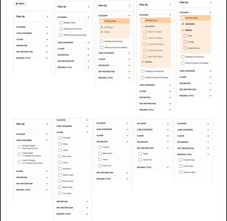
2- Definition of Filters
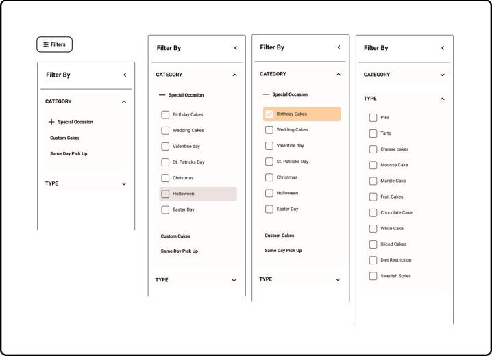
"In the iterative process, I defined the final filters. For example, in the birthday section, I added categories for age and gender, as these are relevant for this type of cake."
"Finally, I detailed the 'Cake Type' categories more precisely across the different sections, based on competitive analysis and usability tests."
3- Iteration on Cake Customization
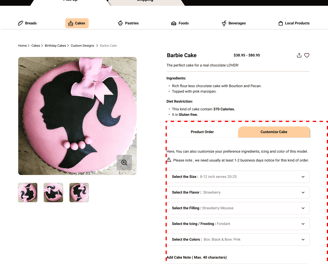
"The most significant aspect I focused on in this redesign and case study is the customization of special occasion cakes. Given the importance of this process for the bakery, I needed to highlight it separately and prominently across different iterations.
After experimenting with various approaches via usability tests, I concluded that adding a 'Create Your Dream Cake' button at the top of the cakes page would greatly capture user attention.
"I incorporated customization options directly into the cake selection page, allowing users to personalize a cake model they select from the bakery’s gallery."
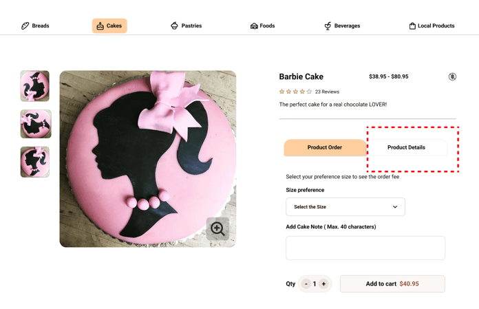
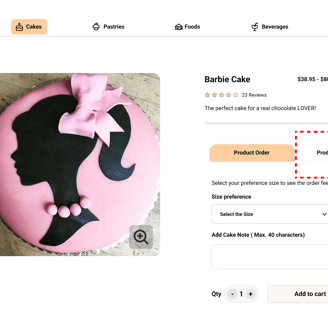
"To address this, I moved the product information below the product name and added a customization section to the same page. This also allows users to make customizations directly on this page if they wish."
3- Cake Customization on the Selected Product Page
Home Page
A/B Testing
Selected Cake Page
Next Steps
What I have learned?
The crucial role of research in enhancing product effectiveness.
Collaborating within the team ensured timely delivery and meeting deadlines.
Testing and iteration improved user-friendliness.
Developing a UI kit ensured consistency and eased communication.
what next?
"The next step in designing this website involves applying separate interviews, testing, and iteration to other products, such as bread, pastries, catering services, and other sections of the store like 'Delivery / Shipping' Section."
Following this, I'll enhance the user experience by conducting additional usability testing and iterations to refine the user flow further.