
RouteWise
Road trip planner from A to Z
Responsive mobile application
Project Overview
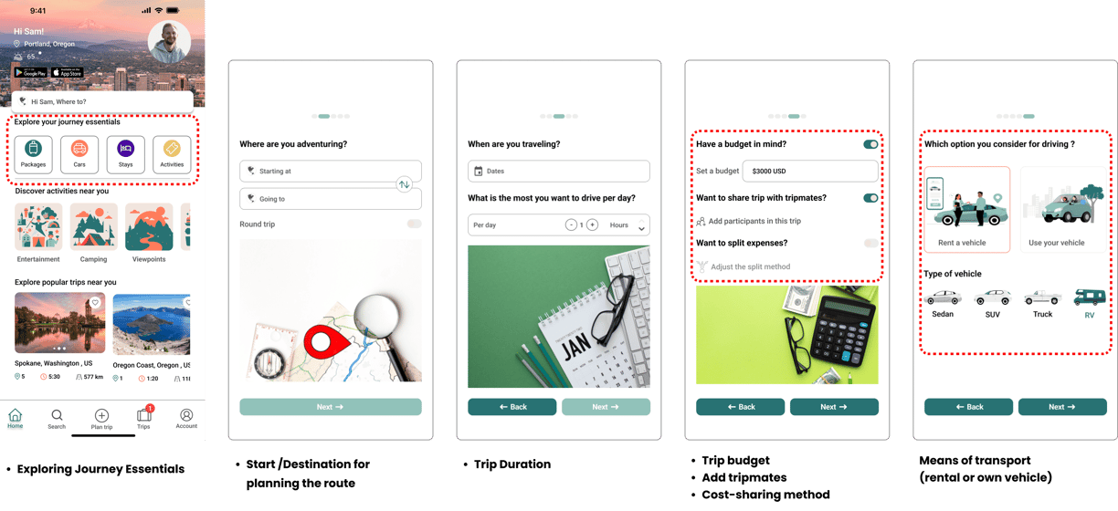
RouteWise is an all-in-one road trip planner for North America!
It simplifies route selection, vehicle choice, booking stays, and planning stops for various activities tailored to the destination, time, and budget—all with real-time cost estimates to stay within your budget.
Travelers can share the trip with others, add tripmates, and split costs with them.

About RouteWise
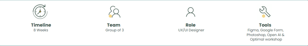

I worked on this project from scratch during a bootcamp at UX-Land School, where I collaborated as a UX/UI Designer to understand user needs and collaborated with a group to design a platform for customizing road trip plans.
Stakeholder Needs
Challenges
Easy, Simple Design for All-in-One Booking: Design a platform to encourage ongoing use for future bookings:
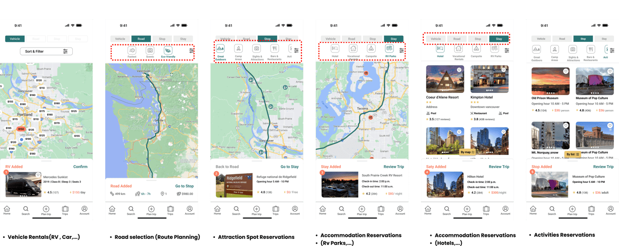
Streamlines route planning
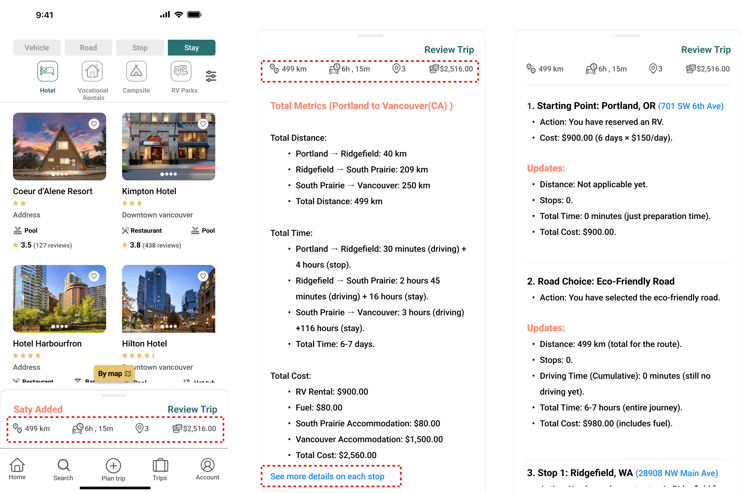
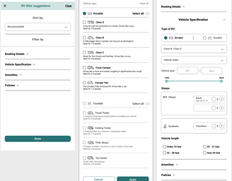
Offers vehicle selection (using your own vehicle or reserving one)
Facilitates booking accommodations
Enables scheduling stops (e.g., activities, outdoor adventures, sights, and attractions)
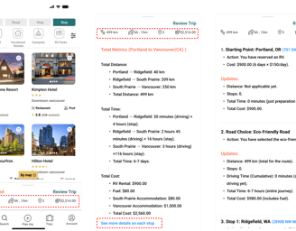
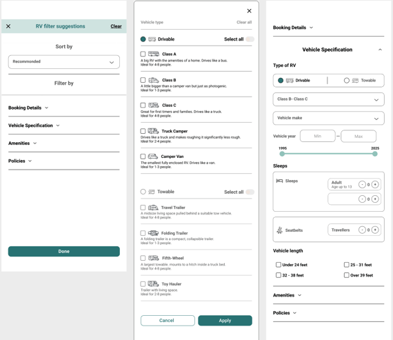
Clear Cost Display: Present costs for each step (each reservation) and trip subtotals clearly, along with a budget-fit indicator, without overwhelming users.
Time Constraints: One of the biggest challenges in designing this project was the limited time available. Each section required separate research, which made managing the timeline difficult.
Testing Limitations: Another major challenge was the inability to test with users in real-life booking scenarios. Instead of conducting qualitative usability tests, I had to rely on lab-based testing, which limited the accuracy and reliability of our insights.


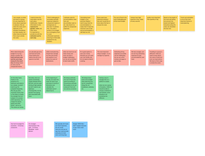
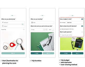
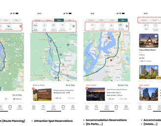
Route Planning: Provide multiple route options.
Vehicle Management: Enable users to select their vehicle or reserve one easily.
Accommodation Booking: Simplify finding and reserving stays along the route.
Activity Scheduling: Allow users to add stops for activities, outdoor adventures, and attractions.
Cost Management: Set trip budget, present clear reservation costs, and subtotals with budget comparisons.
Road Trip Enthusiasts: Individuals or groups planning road trips across North America.
Budget-Conscious Travelers: Users who prioritize managing expenses and staying within a budget.
Families and Groups: Travelers needing a streamlined platform for multi-stop trips and shared expenses.
Adventure Seekers: Users interested in exploring scenic routes, outdoor activities, and attractions.
RV and Vehicle Renters: Travelers without their own vehicle or looking to rent one for the journey.
Target Users
key Tasks
Designe Thinking
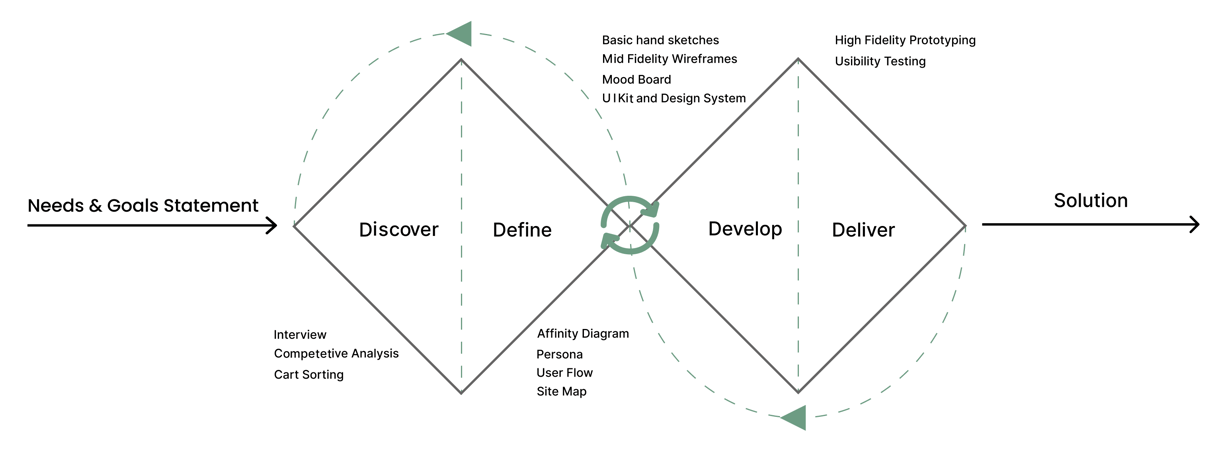
Discover
For trip planning, I focused on designing a package that includes roads, vehicles, activities, and accommodations. Each area required individual consideration, which I addressed separately during the interview process.
To understand users' pain points and develop effective solutions, I employed a comprehensive research approach using the following methods:
Interview
Competitive Analysis
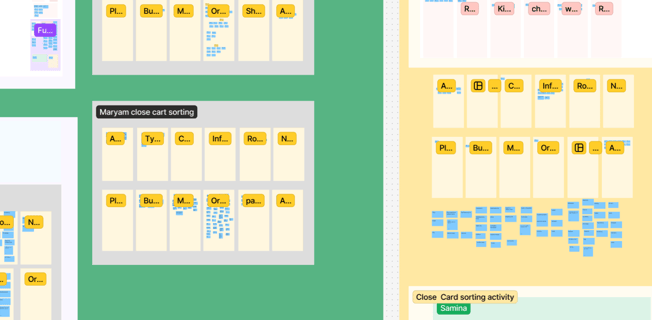
Cart Sorting
Interview
I selected people who take road trips several times a year (cars/RVs) or tour leaders who manage travelers' needs. I used open-ended questions to foster discussion rather than a strict Q&A format.
I identified user pain points and expectations and discussed them with our stakeholders. Considering the business's value proposition and time constraints, I began defining the key contents for the information architecture.
Competitive Analysis
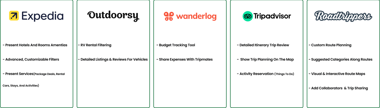
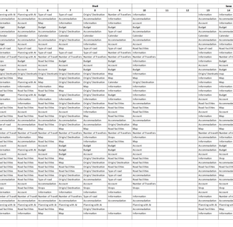
I evaluated 12 online platforms related to road trips planning, RV/car rentals, and hotel/accommodation reservations, by examining important features based on stockholder needs. Using these features, I designed an all-in-one road trip planning that provides essential, easy-to-use tools.
Our analysis shows that Roadtrippers was the most competitive platform. However, it does not offer direct reservations for RVs, cars, or activities. So, for accommodations, I conducted a competitive analysis on Expedia, Booking.com, Airbnb, and TripAdvisor. For car and RV rentals, Outdoorsy and similar platforms were analyzed.
Below, I outlined the key aspects that influenced our design.
Cart Sorting
Insights from interviews directly influenced the card content. Based on the competitive analysis, I adjusted the content to improve its relevance and effectiveness.
Afterward, I conducted card sorting using the Optimal Workshop and Figma (Open / Close cart sorting) .
Later, I used Excel to compare the results and identify key categories.
Over time, I made further iterations by consulting stakeholders and conducting usability tests.

Define
Affinity Diagram
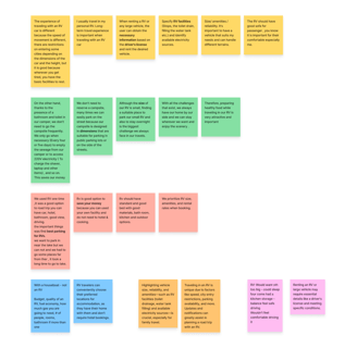
Road Condition | Features
Budgeting | Costs Estimates
Vehicle | RV Reservation
pain points
Estimating Travel Costs: Difficulty in predicting travel expenses.
Lack of Budget-Friendly Planning: A feature to help users manage major travel costs within their budget
pain points
pain points
Expectations
Clear Pricing: Users expect transparent pricing by details without overwhelming.
Explore Options Based On Budget
Cost Breakdown: Users want a breakdown of trip costs for each participant that can be easily shared.
Adjust Based on Budget: Users want the ability to modify plans easily to fit their budgets without confusion.
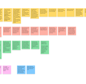
Lack of information on road conditions, safety, and vehicle-specific routes.
Expectations
Personalized Route Suggestions: Users want routes based on options like fastest, optimal, or scenic, with filters for toll-free or paved roads.
Clear Road Comparison Info: Users need simple details to compare road options, like distance, travel time, and costs.
Size and Comfort: Users may struggle to choose the right vehicle size for comfort and amenities.
Access Restrictions: Some locations have vehicle size restrictions or limited parking.
Expectations
Clear Vehicle Information: Users expect detailed info about vehicle features, size, and suitability for their needs.
Filter Options: Users want to filter vehicles by amenities (e.g., beds, bathrooms, kitchen) and size to match their needs and budget.
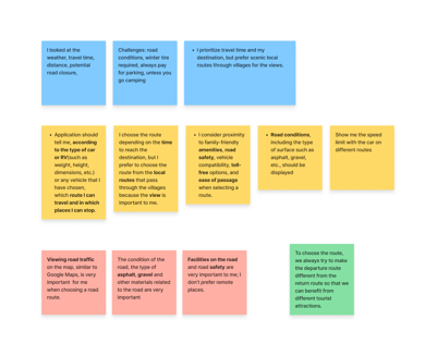
Stops | Stays
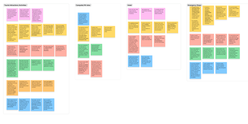
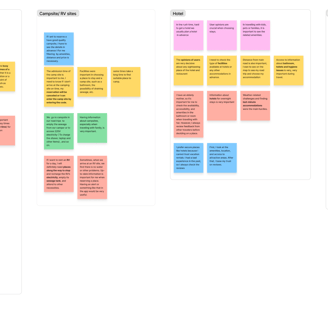
pain points
Expectations
Detailed Facility Insights: Users expect information on amenities—like parking, restrooms, safety, and nearby services at each stop—to be accessible, clear, and well-defined.
User Reviews for checking reliability & Safety: Reviews help users assess safety and reliability based on others' experiences.
Clear Accessibility: Accessibility features should be clearly displayed for easy access.
Family and Pet-Friendly Options: The platform should highlight family- and pet-friendly services.
Emergency Stops Information: Clear information on emergency stops, like medical facilities, food, and gas stations, is essential.
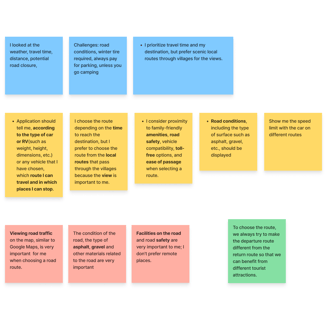
pain points
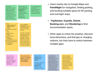
Lack of a Dedicated All-in-One Platform: Users mention there is no platform that consolidates everything they need (like stops, attractions, and parking) based on personalized preferences.
Switching Between Apps: Users find it inconvenient to use multiple platforms to get all the necessary information.
Simplicity and User-Friendliness: Users expect the platform to be easy to use and not overly complex.
Up-to-Date Information: Keeping the platform's information updated is essential to avoid confusion and errors during trips.
Expectations
Lack of Attraction and Accommodation Info: Users have no dedicated comprehensive platform for finding information on scenic spots, tourist attractions, and accommodations—often relying on Google Maps but switching between platforms breaks the flow.
Based on Insights from the interviews, I created an Affinity Diagram and identified pain points and expectations for each key step.
Used Applications | Features
Our chosen persona represents users who value time management, budgeting, and organized planning. The users I interviewed are eager for road trips but avoid them due to limited time. They need a comprehensive platform to meet all their travel needs in one place, helping them manage both time and money while planning a memorable road trip.
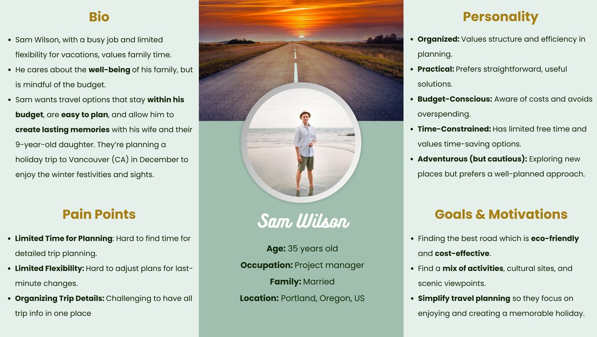
Persona
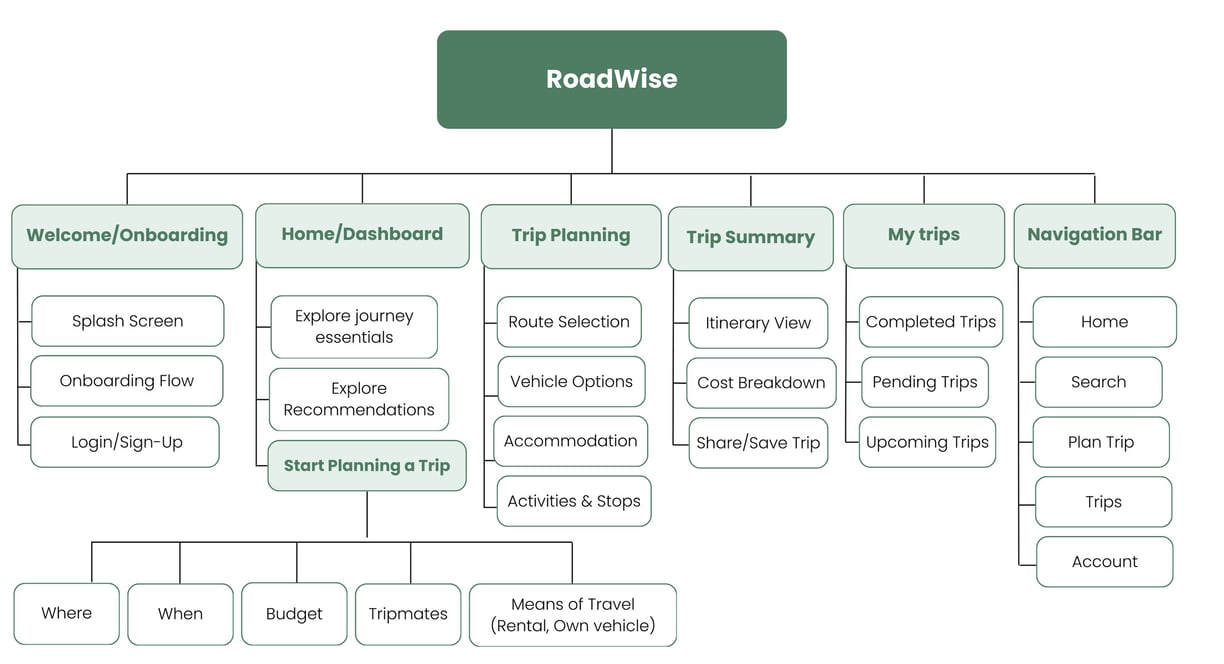
Site Map
To ensure our information architecture meets user expectations, I conducted open/ close card sorting using the Optimal Workshop & Figma. After the initial exercise, I developed our first version and iteratively refined it based on user testing and competitive analysis.
Here is our final site map:
I added a customization task to the user flow for personalized packages, providing a seamless experience for busy professionals like Sam.
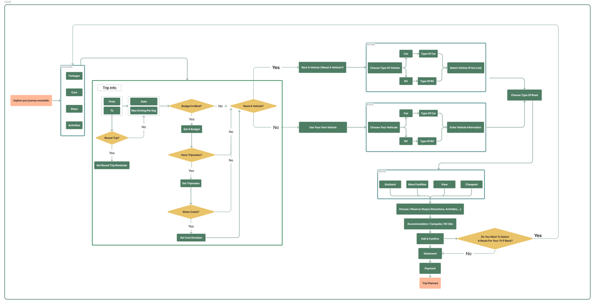
Final User Flow
Develop
After analyzing all of our research, we began to understand our project’s needs and challenges and tried to find a solution in our design.
Easy, straightforward flow to gather essential information to start planning their trips.
Clear details on route & Pricing without overwhelming:
Easily plan road trips with smooth intuitive navigation, select favorites and spots based on needs through accessible, comprehensive filtering.
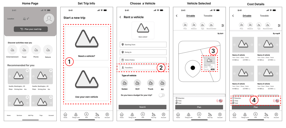
Iterations- Step 1
Sketches and Wireframes
I started with hand-sketched low-fidelity wireframes to facilitate team communication during the early design stages. Later, I used Figma to create mid-fidelity wireframes, visualizing page layouts and design direction for stakeholders.
These wireframes show a part of my design that went through multiple iterations. After finalizing the layout, I moved on to the high-fidelity design for the rest of the project.

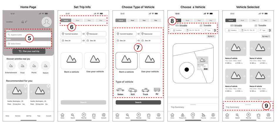


Iterations- Step 2
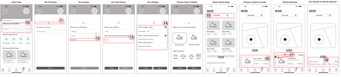
Iterations- Step 3
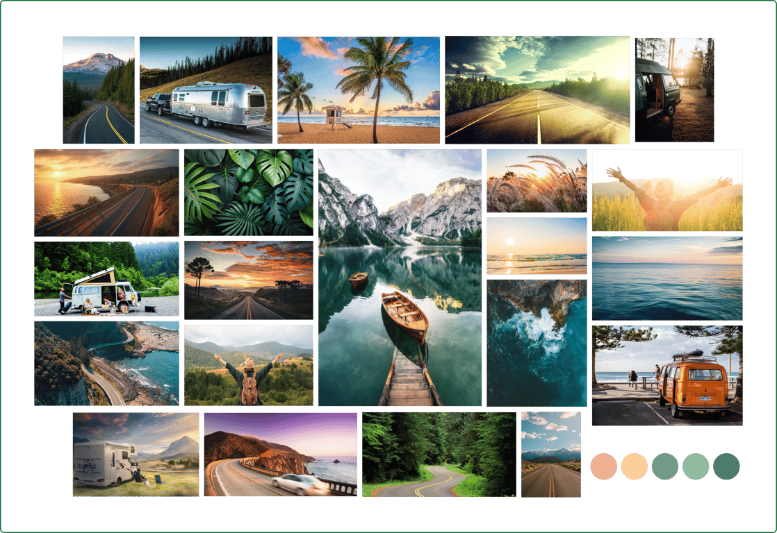
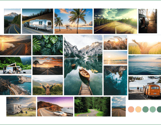
I shaped our mood board inspired by nature, ultimately arriving at a color palette that includes a variety of green shades symbolizing nature and vitality, along with cream tones inspired by the sunrise.
Moodboard
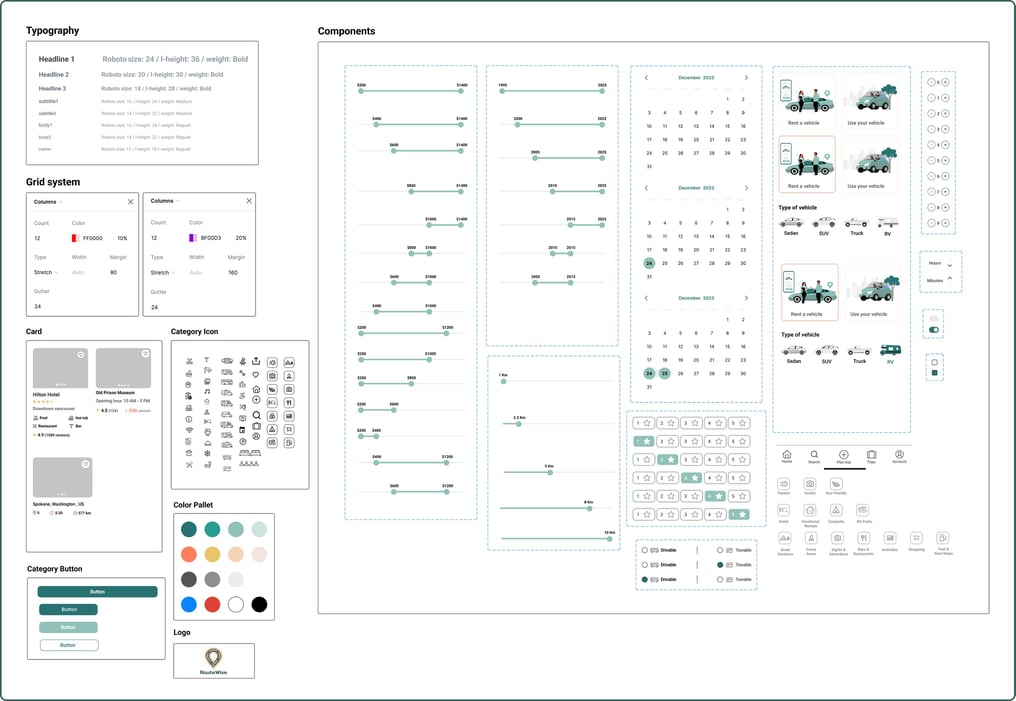
UI Kit
We developed a complete UI kit to serve as a reference for templates and components. This kit ensures that interface development is smooth, consistent, and efficient throughout the project.
Our UI kit balances casualness with a color palette of dark & light green, light orange & brown tones, modern and easy-to-read fonts.
Deliver
High Fidelity Wireframe
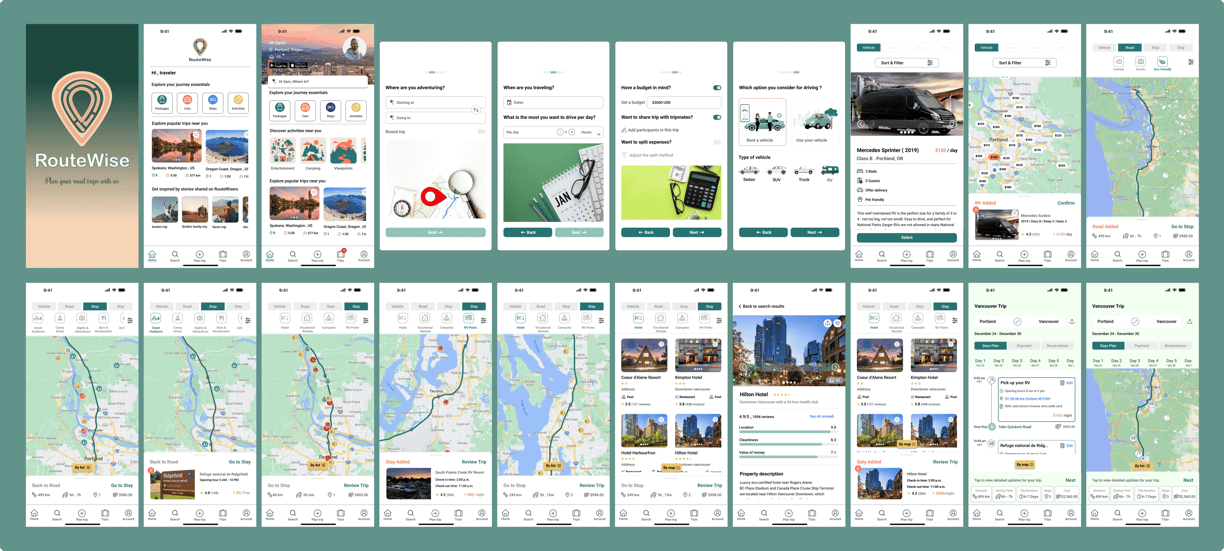
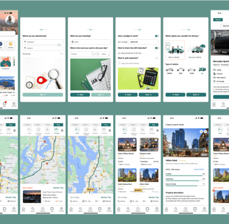
Protoype
Here is the last prototype, displaying what I've achieved through our design process.
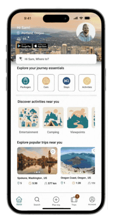
After many iterations, this represents a portion of the current high-fidelity design.

